GeoDataViz: map symbols
Maps use symbols to label real-life features and make the maps clearer
A map is a graphical visualisation of the world around us and is made up using a variety of symbols to help us represent that geography.
Maps use symbols to label real-life features and make the maps clearer. With so many features on a map, there would not be enough space to label everything with text.
Symbols can be small pictures, letters, lines or coloured areas to show features like campsites, pubs or bus stations. If you look closely at a map, you will see that it is covered in symbols.
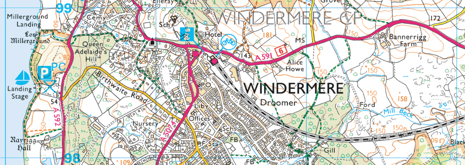
Point data can include telephone poles, wells or trig pillars and can be represented using shapes, symbols or even logos and sometimes may be followed by a text description or leader line
Line data can include roads, paths or railways and can be as simple as a blue line representing a river or more complex like road features where two lines (the road casing) encloses a coloured road fill.
Polygon data can include woodland, water or sand and are used to represent area features that can be filled with colour, patterns or symbols. At a small scale a woodland filled with coniferous trees could be represented as a green polygon whilst at a large scale the same woodland could be depicted with the same green polygon and include a pattern fill using a symbol denoting a coniferous tree.
When deciding on your symbol choice or design you need to consider many factors before making your final decision.
Max Roberts (www.tubemapcentral.com) recently said:“People have expectations about the meanings of symbols and styles. The meaning selected by the designer should be compatible with the expectations of the users”
Get your symbol choice or design right and you have met your users expectations and produced a map that is easy to use and clear in its representation of the world around us.
Feature type
What is the feature you are trying to represent? What is the best way of achieving this? At one scale a features representation may be best suited as a point whilst at another scale it might be best represented by a polygon.
Scale
A map scale is the size ratio of a feature on the map to the one in the real world.
Small scale maps show large areas in less detail and generally use more symbols. We need to simplify the geography as the location of a feature is more generalised.
Large scale maps show small areas but in great detail so require less symbols. This is because features can be shown on or close to their correct position. You can see from this GIF how you might represent the same information differently across a range of scales and different types of map.
For instance at its smallest scale the city of Edinburgh is depicted with a point, polygon and label. The size of the point and text is determined by the scale of the map whilst the polygon, which is used to show the urban extent, is generalised to suit the scale. As we move through the scales the text changes size, the point disappears and the urban extent polygon becomes less and less generalised.
Legibility
Can your symbol be understood and interpreted clearly? Sometimes you may want to use the same symbol across a range of scales so you need to make sure your choice of symbol can be scaled accordingly and does not lose any of its detail as you reduce it in size.
Colour
The colour of your symbol can be just as important as the design itself and its worth considering a few points before making that final decision.
- Does it work within your chosen map colour pallette?
- Where does your symbol sit within your visual hierarchy? If a particular symbol is important to your maps message then its colour choice needs to stand out above the colour of your other map features.
- Does your symbol sit within a particular feature set? For instance on OS maps all tourist features are depicted in light blue. This breeds familiarity and confidence amongst your map users in understanding what your symbols mean.
- Be careful your chosen colour does not have a hidden perception. Some people may denote red as meaning danger or warning something you may not wish to be associated with your chosen symbol.
Data type
A symbols depiction can also be determined by the type of data you are using. If your map information is qualitative then all your features are of equal importance and therefore you should not make any of your symbols feel more important than the other. You can vary the symbols shape, colour or design but they should all appear as equal. If your map information is quantitative then all your features are of different importance. Therefore your symbols size, colour or fill is varied to make features appear more or less significant than others.
The last thing to consider is your map legend or key. The best designed symbols will be those that can be interpreted immediately and do not require the map user to refer to a legend. However, this is not always possible and in this instance its important to include a legend so as your user can easily understand what your map symbology represents. When considering your legend layout try to group all your related features together. For example, all road features should appear together (roads, service stations, junctions, gradients etc.) and make sure you depict your symbols on your legend at the same size as they appear on the map. This will make sure your map users transition from map to legend is as smooth as possible.
Access our GeoDataViz Toolkit
In this repository, you'll find resources, assets and other useful links.
Sharing the latest news about OS. We can license you to use OS maps in print, online and film format. For more information and resources for journalists, bloggers and media professionals, email pressoffice@os.uk or call 023 8005 5565.