What is Cartography?
1. What is Cartography?
Cartography is often described as the art, science, and technology of map making; however, this definition varies depending on where you read about it, or who you speak to.
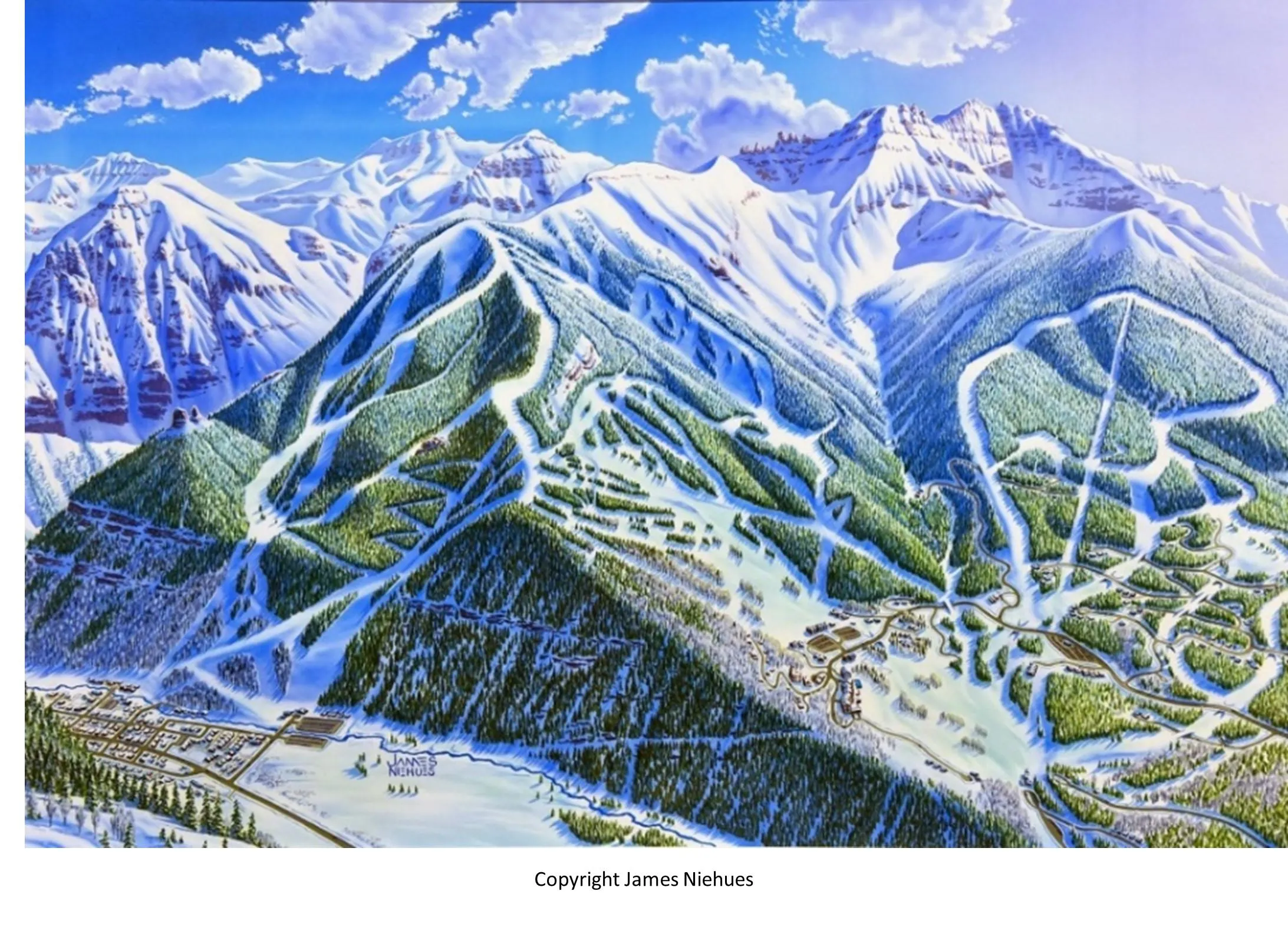
So, cartographers make maps… but what is a map? This has been widely debated and has arguably evolved over time. We’ve included a few ‘maps’ below. What do you think? Are they maps, are they charts/diagrams, are they art – or are they something entirely different?
At Ordnance Survey (OS), we view maps as a graphical or symbolised representation of reality. However, the form a map takes depends on what it is going to be used for. The map you’d create for an avid hillwalker navigating complex mountain terrain would be very different from a map used to show the split of votes across a country after an election, or the migratory route of birds between continents.
A cartographer is therefore responsible for understanding the use case, selecting the right data for the task, deciding what to show or exclude, and then presenting it in a way that is understandable and useful. It is trickier than you’d think. With vast quantities of geographical data available online and a wide variety of mapping tools, it is so easy to create a ‘map’.
But what makes a good map?
In this blog we explore some aspects of cartography and share our knowledge on the subject of maps and data visualisations. We look at how to symbolise reality to make a map understandable, what map scale means, and how we generalise features as we ‘zoom out’ to maintain their legibility. We then delve into how to define a position on a map and how you might go about putting the round earth on a flat piece of paper.
Finally, the OS Geographic Data Visualisation (GDV) team give you their top tips for creating effective maps through their cartographic design principles, along with giving you access to their cartographic design ‘toolkit’ to help you get started.
2. Symbolisation
As mentioned above, maps are graphic or symbolised representations of the real world. No map can show everything in the real world, as it would be really cluttered and confusing. As such, maps show just a selection of features dependent on the purpose of the map and the intended audience.

Symbolisation is the way in which geographical data is classified and represented on a map. It is extremely important to the overall visual impact of the map, and how good the map is at meeting the needs of the user.
Geographical features and phenomena can generally be represented as points, lines, or polygons. Text may be included in the form of a label. Together, these are known as the ‘graphic elements.’ It’s a cartographer’s job to decide how each feature is represented. This will likely depend on the purpose of the map, and the map scale. For example, a river might be shown as a polygon on a map of a town centre, but as a simple line on a national topographic map. Similarly, a city might be shown as an area with a boundary full of buildings, car parks, and greenspaces, but in an atlas shown as a single point (more on these ‘generalisations’ later).
In order to make maps clear and legible, it’s important that the symbols are styled in a sensible way to make the map easy to understand.
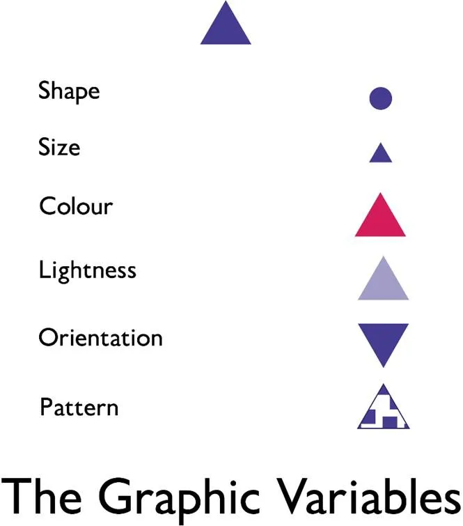
This is done by changing what is known in cartography as the ‘graphic variables.’ These include changing the size, shape, colour, lightness, orientation, and pattern of points, lines, and polygons.
They can be applied in isolation, or used in combination depending on what you are trying to show.
Text is then used to add meaning or context to the map, if required.
Points
When designing point symbols, it is important to think about what they are representing. Points can be represented simply by a geometric shape such as a circle, square, or triangle. Or points can represented by conventional symbols such as a red cross for a hospital or an ‘i’ for information point. Alternatively point symbols can be mimetic i.e. they look like the object they are representing, such as an aeroplane for an airport or a picnic bench for a picnic site.
Conventional and mimetic symbols can be used to enhance a map and give it meaning, making certain features immediately identifiable to the user without them needing to refer to the legend. On OS maps, we commonly use conventional and mimetic point symbols.
Another thing to think about with point symbols is how their size can be varied to show the relative importance or size of a feature. For example, when using a point for a place, the symbol for the city could be made larger than that of the same symbol for a village.
Lines
Lines can be varied in many ways, such as being dotted or dashed, and are often quite complex. Roads, for example, can be made up of a road casing with a coloured fill. Using colour can help add meaning to your map, particularly if conventional colours such as blue for water are used. Lines representing the same feature class (e.g. roads) can be varied in colour and size to reflect their relative importance. For example, a motorway would be shown to be wider than a secondary road.
Polygons
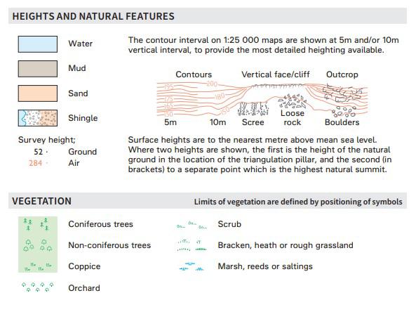
Polygons often form the background to the map but may be important symbols in their own right. Polygons can be filled with a solid colour or with a texture or pattern. The colour of polygons can be altered to give meaning to a map, particularity by using conventional colours, such a green for woodland, brown for mud, yellow for sand, and blue for water. Patterns such as trees or marsh symbols can be added to polygons to further aid user understanding. The lightness of polygons can also be altered to give a visual order to quantitative data, such as in a choropleth map where darker colours indicate a higher value.
Text
Text in the form of a label, if used effectively, can add meaning to a map and help users understand what they are looking at. However, poor use of text can detract from the map, making it cluttered and difficult to read.
There are many elements of text which can be altered. The first is the typeface (or font). Here, it is best to stick with commonly used fonts which are clear and easy to read, and limit the number of different fonts used within a single map. When choosing a font, you can choose whether to use a serif (more decorative) or sans-serif font. Serif typefaces are commonly used for natural features whilst sans-serif typefaces are often used for manmade/human features. As such, text can be used to differentiate between feature classes.
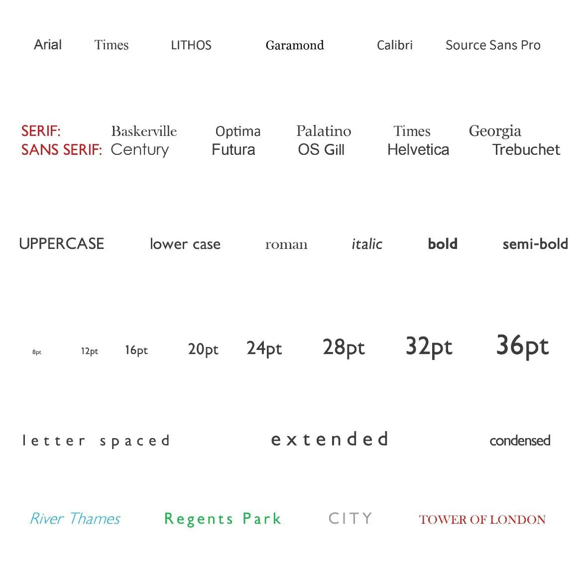
It is also possible to alter the characteristics of the type, such as making the text upper or lower case or bold/italic. Bold can be used to highlight more important features whilst italics are often used for historic features. Text size can be altered to show feature importance, such as labelling a country using a bigger font size than that used for a city label. Maps use smaller text sizes than you might think – a common map text size is just 6pt.
Another way to alter text is by varying the character spacing. This is commonly used when labelling areas; spreading out the text such as a country or ocean name so that it spans the extent of the area it is labelling. Finally, the colour of text can be varied to differentiate between feature classes. For example, water text is often blue, and text associated with parks and greenspace is often green.
When adding text, it is important to think carefully about what the user needs and whether text is required to add meaning to the map.
With all of these, the use of colour is important and is often fundamental to the success of a data visualisation. Colour can help with many elements of your design from improving visual contrast to simply catching the eye. Careful use of colour enhances clarity, aids storytelling and draws a viewer into your dataset. Poor use of colour can obscure data, or even mislead.
Think carefully about what different colours mean and how this relates to your map. For example, red is often associated with anger, stop, danger, or heat. Think also about your data; is it qualitative (not ordered in any way) or is it sequential, requiring some form of colour ramp? Read more about colour in our GDV Toolkit.

3. Scale
All maps are reduced (scaled down) versions of the real world. Scale is therefore represented as a ratio of the map distance to the ground distance. For example, a scale of 1:100 means that one unit on the map represents 100 of the same units on the ground.
Let’s say a road is 10,000cm long (100m) and you want to represent the same road as 10cm on the map, the scale can be calculated by dividing the real-world distance by the map distance. In this case giving 1,000. The scale is therefore 1:1,000 with 1cm on the map representing 1,000cm on the ground.
Commonly used scales at OS are:
1:10,000 where 1cm on the map = 10,000cm on the ground (100m)
1:25,000 where 1cm on the map = 25,000cm on the ground (250m)
1:50,000 where 1cm on the map = 50,000cm on the ground (500m)
The scale of a map is often represented by a ratio (e.g. 1:10,000) or as a statement in words such as ‘one inch to one mile’ but is also often represented by a scale bar, allowing users to visually assess distances on the map. Not all maps need a scale bar, particularly if it is of a familiar area or is at the continent scale. The distortion to distance caused by a map projection means the scale bar would only be correct for one line on the map (more about projections later).
The choice of map scale is intrinsically linked to the purpose of the map and what it needs to show, to meet the users’ requirements. For example, if you are planning a driving route around Scotland, you’ll want a map which shows a large area (possibly the whole of Scotland) but don’t need details of every building, bus stop, and café. This is known as a small-scale map. On the other hand, if you are making a map for a walking tour around a village, you would want a map of a small area but with lots of detail. This is known as a large-scale map.
To explain small scale and large scale a bit better and help you get your head around it:
- Small scale maps require a small sheet of paper to show an area with a smaller amount of detail.
- Large scale maps require a larger sheet of paper for the same area and show a much larger amount of detail.
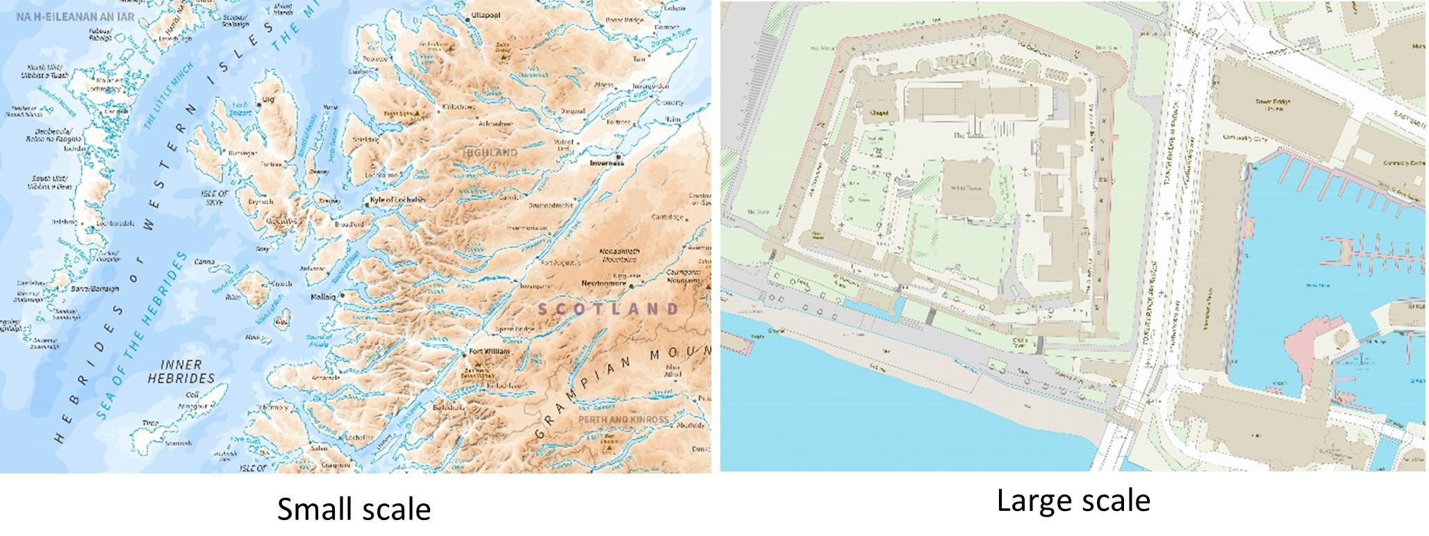
As mentioned earlier, scale has a huge impact on what features we show and how the same feature might be depicted differently at different scales. For example, take an airport: on a large-scale map, you would show the airport boundary, runway detail, buildings, car parks and more. However, on a small-scale map, you would perhaps only show a single point symbol.
Explore map scales further here: A beginners guide to understanding map scales
4. Generalisation
As maps represent reality at a very reduced scale, no map, even at large scales, can show everything. This is because there is a reduced amount of space available to represent features and this space reduces as the scale decreases. Generalisation is therefore the process a cartographer (or more recently, a computer algorithm) undertakes to alter the way in which features are represented in order to maintain legibility as the map scale decreases.
There are many techniques which can be deployed in order to achieve this aim. Here are a few of the techniques cartographers use to generalise a map:
- Elimination: Removing certain features which are not necessary at the new scale such as removing a small building from a built-up area or removing individual bus stops.
- Amalgamation (or merging): The joining together of adjacent objects of the same type, such as merging individual buildings into a single built up area, or multiple patches of woodland into a single wooded area.
- Simplification: Makes features legible by removing some of the variation such as smoothing out meanders in a river or removing some of the smaller tributaries of a river network. The key is to maintain the general characteristics of the feature you are simplifying.

- Exaggeration: Small or narrow features are increased in size in order to maintain their legibility whilst retaining a defining feature. For example, maintaining a visible opening to a bay or showing roads wider on the map than their true scale to make them visible.
- Displacement: Moving features apart to ensure the clarity such as moving a road and river apart to prevent them overlapping and create visible separation between the features when the scale is reduced.
- Collapse: Similar to amalgamation but may result in the change of dimension of a feature such as a polygon to a point symbol. For example, a city may be shown as a polygon at large scales but as a single point at smaller scales. Similarly, dual carriageways shown with a central reservation may be reduced to just a single line road feature.
But how do we decide how to generalise things?
Still to this day, the method of generalisation and level of generalisation is down to the digression of cartographers. It is a cartographer’s job to understand what the user requirements are and the purpose of the map and then select and symbolise the data appropriately.
It is often quite subjective and varies from place to place (and cartographer to cartographer). For example, a small building in an urban area may be eliminated due to its size, however the same sized building in a very rural area, where it is the only building for miles and thus a key feature of the landscape, would be retained. Features are also interrelated, making generalisation complex.
For example, if you simplified a river network by ‘smoothing’ out a few of the meanders, the contours would have to be simplified in a way that they match the river network such that rivers appear the lowest point in the topography and flow downhill.
More recently, computer algorithms have been developed which allow automatic generalisation, based on a set of pre-programmed rules. However, the success of these is still quite varied and often human judgement gives more pleasing results.
5. Coordinate Systems
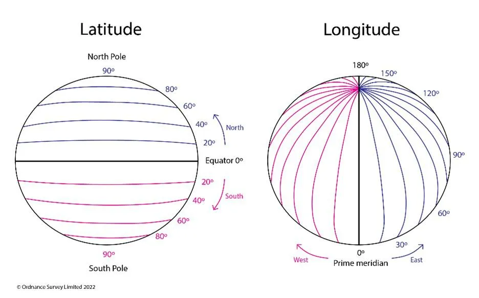
A coordinate system allows us to identify a position on the Earth’s surface and relate it to a position on a map, and vice versa. The two most common coordinate systems are latitude/longitude or a national grid system.
Latitude and longitude are theoretical lines, superimposed on a 3D model of the Earth. Lines of latitude run parallel to the Equator whereas lines of longitude run from pole to pole. Together, these forms what we call the ‘graticule.’ Latitude is measured as the number of degrees, minutes, and seconds a place is north or south of the equator whilst longitude is the number of degrees, minutes, and seconds a place is east and west of an arbitrary ‘zero’ line – almost always the Greenwich Prime Meridian.
For Great Britain (GB), Ordnance Survey created the British National Grid as a way of defining locations across GB. This coordinate system only applies to GB and is a rectangular grid which is superimposed on the curved surface of the Earth. The origin of this grid (bottom left corner) is west of Cornwall meaning that all grid references are positive. Coordinates are stated as the distance east (Eastings) of the origin, followed by the distance north (Northings) of the origin.
Always remember: Along the corridor (eastings) then up the stairs (northings).
A position in the UK can be easily communicated by providing a grid reference using this national grid system and is used on all OS maps.

So, how does it work?
The UK is split into 100km squares, each with a two-letter identifier. These 100km squares are given a number from 0 to 9. These 100km square are split into ten 10x10km squares and split again into 1x1km squares. These squares are the blue lines on OS Landranger and Explorer maps.
From this, a 6-figure grid reference can be given, giving a position to within 100m.

Tip: On the OS Maps App, if you hold your finger on the location you want a grid reference for, it will display the National Grid reference.
Further reading on coordinate systems and grid references:

6. Projections
The earth is a three-dimensional object whereas most maps are two-dimensional. As such, a mathematic approach is required to present the curved surface of the Earth on a flat surface such as a paper map or a computer screen – this process is known as a map projection.
It is however impossible to represent a curved surface on a flat plane without distorting one or more characteristics such as distances, directions, shape, or area. Try it: peel an orange and try to squash it flat without tearing or creasing it …. spoiler - you can’t.

Different projection methods preserved different characteristics. This means that the best projection to use will depend on the purpose of the map (plus the shape of the area to be mapped and its location on the globe). The choice of map projection becomes very important for maps greater than the size of a small country due to the distortions created across large areas. A poor choice of projection can result in the misrepresentation of what you are trying to show. For maps of small areas, the distortion is minimal and therefore the choice of map projection matters less.

As noted above, different map projections preserve different characteristics. Those which keep areas correct are called ‘equal area’ projections, those which preserve distance are known as ‘equidistant’ projections, and those which preserve angles are known as ‘conformal’ projections. In addition, there are a number of projections which are a compromise between these.

Conformal Projections
The projection often used for maps of the world (rightly or wrongly – you decide) is the Mercator projection, created by Gerhard Mercator in 1569. This projection was designed to represent sailing courses of constant bearing (rhumb lines) as straight lines. This is a conformal projection which projection preserves angles and means that a straight line drawn on a map between two locations represents a line of constant bearing i.e. measure the angle on the map, set your compass and off you go.
It is still used to this day for maritime and air charts. It does however distort areas and distances and this distortion increases toward the poles. On a Mercator projection, Greenland and Africa appear to be a similar size, however Africa is approximately 14 times larger than Greenland. Not a great projection to use if you want to represent the relative areas of countries correctly.

Equal Area Projection
Equal area projections are commonly used for mapping distributions such as population density, land cover, or climatic regions. When mapping distributions it is important that the relative areas of different regions or countries are presented correctly. Equal area projections however distort shapes, angles, and distances. Examples of equal area projections include Albers Equal Area Conic, Equal Earth, Gall-Peters, Mollweide, and Eckert IV. The distortion to shape can however make some areas look unrecognisable. If you look at the little circles on the Albers Equal Area Conic Projection, you can see their shape is preserved well in mid Northern latitudes. As such, this projection is often used for maps of Europe.

Equidistant projection
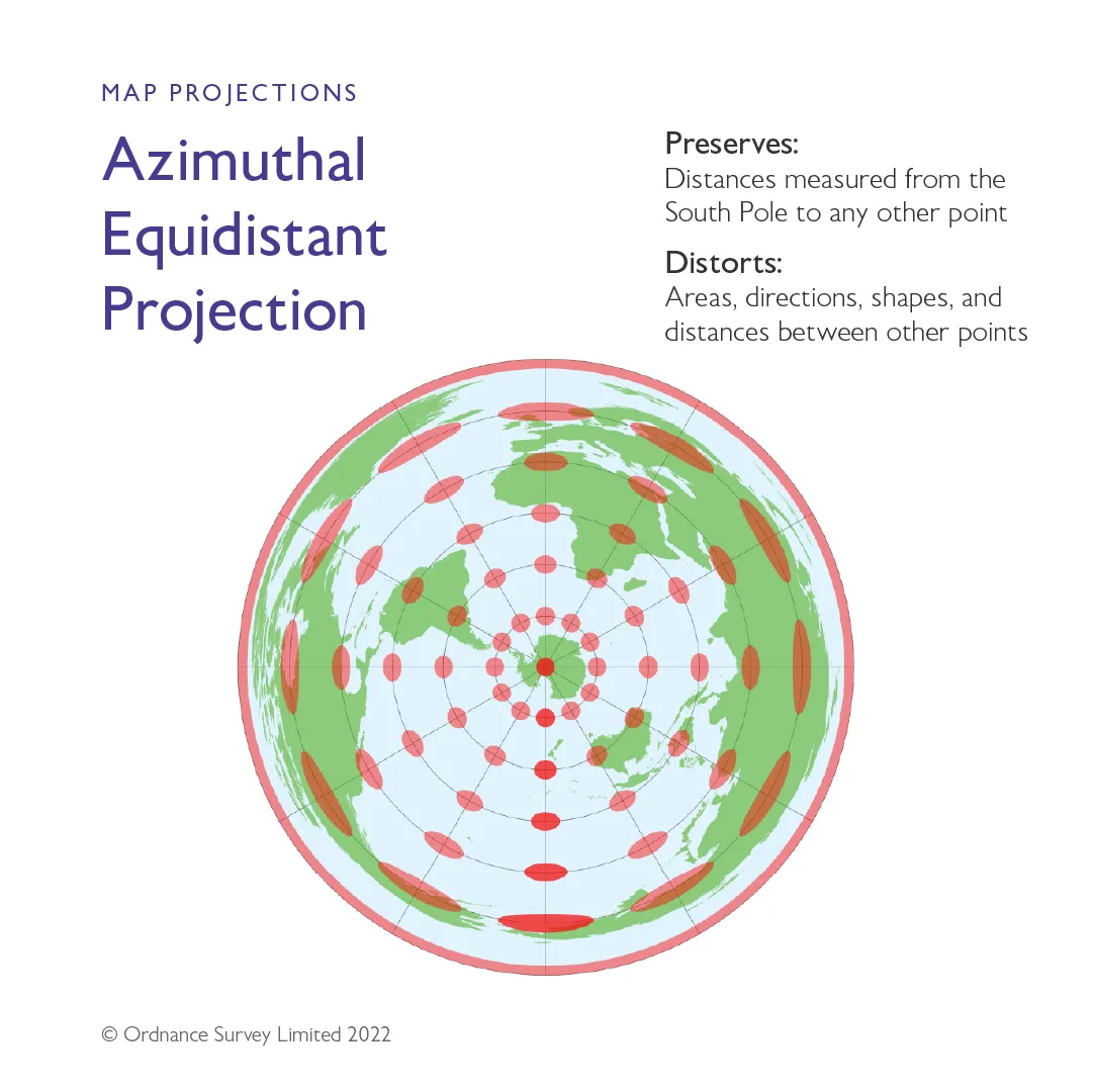
Equidistant projections do as they say, they preserve distances and therefore should be used if representing the distance between two points correctly is important to the purpose of the map. Most equidistant maps preserve scale along one or more lines or between two other points on the map. No projection can preserve all distances. One type of equidistant projection is an azimuthal equidistant projection which preserves distance from a single specified point on the projection and any other point on the map and is often used to map the polar regions.
7. Cartographic Design
With the release of open data and a boom in the open-source industry, more people than ever before are delving into the world of cartography. Maps are becoming widely adopted by technologies and services as a form of data visualisation, by people who may not have come from a traditional mapping background. Too often a good idea might be let down by the poor application of cartographic techniques.
At Ordnance Survey, we have a dedicated Geographic Data Visualisation (GDV) team who specialise in creating great maps and data visualisations. As a team we have come up with some design principles which we believe lead to better map design. These are explained in detail in our GeoDataViz Toolkit along with a load of other useful resources to help you create great maps.
Ordnance Survey’s eight principles of cartographic design
Understanding user requirements
Fully understanding the requirements of the user is vital to the success of any map! An effectively designed map is one in which the intended message is clearly communicated to the map user. This is only possible by fully understanding what that message is and how the map is intended to be used.
Before you start designing your map, ask the following questions:
- What information does the map user require?
- How will they use the map?
Keep asking these questions throughout the map design process. If you realise you have added something to your map that the user does not require, remove it! It will only result in distraction or cause confusion if it is kept.
Consideration of display format
To achieve maximum clarity a map should be designed from the very beginning with its final display medium in mind. Is it going to be viewed on a phone screen or a computer screen? Is it designed to be printed, and if so, what size will it be and under what lighting or environmental conditions will the map be used?
Understanding the display format will allow you to make decisions relating to the scale of the map, the colour mode (RGB for screen or CMYK for print), the minimum point size of text, the size of features, and the level of functionality or interactivity given to the user.
Clear visual hierarchy
The aim here is to draw attention to certain elements of the map and push those of less importance further down the visual plane - although certain features are less important, they may still be required to give context. If not, then they should be removed. This helps the user differentiate between map features and helps them comprehend the maps message effectively. Key to this is the contrast between the ‘figure’ (the focus of the map) and the ‘ground’ (background or contextual information). This can be achieved by adjusting the graphic variables discussed above in relation to symbology.
Simplicity
Cartography aims to portray spatial information in an appropriate way in order to transform information into knowledge. The inclusion of unnecessary information makes this process less effective, and one should always assess that information’s value to the user against map clutter and confusion.
Legibility
All map elements need to be legible, meaning that they are readable, understandable, and recognisable at the intended viewing scale, and on the media on which the final map will be displayed.
Legibility of most map features depends on colour and size. Symbols need to be simple enough to be recognised and offer good contrast against the background and large enough to be visible, but not so large they clutter the map. To achieve legibility, the process of cartographic generalisation is often required.
Consistency
Consistency provides a map with balance. It enables features to be perceived as being organised into groups and it allows maps themselves to belong to a family of products through a shared identity.
Consistency leads to effective communication through the concept of familiarity. If the same symbol is used repeatedly to depict the same feature, then once the user understands what that symbol represents, they can recognise it immediately thereafter. Conversely, inconsistency can lead to confusion and poor communication of the map’s intended message.
Accessibility
Making maps and making geographic data and accompanying stylesheets easily obtainable and usable is imperative to successful use. Accessibility factors to consider in the design process include distribution formats, user disabilities, cost, and intuitiveness in use.
Many maps are now presented in an electronic format and thus it is important to ensure that the file formats and software required to view the map are accessible.
Good maps should be designed with the user’s ability in mind, and should be easy and intuitive to use. In addition, to be fully inclusive, attention should be paid to the colour pallets used and how they work for people with colour vision deficiency (CVD).

Good Composition
Composition concerns the arrangement of all the different parts of a map, from the map’s title to the scale bar. It is both how the map is structured and positioned, and how the map works alongside any additional information. All elements of the map should work together to provide a clear and complete understanding to the user. Their style should also be harmonious or complementary and the composition as a whole should appear balanced.
The aim here is to achieve balance but the ‘visual path’ on which you take the user should also be considered.
There is no right or wrong answer to how to create a good map and what works depends on your use case and data. Just try and keep a few of the things we’ve explored above in your mind when you start creating your map.
If you want to find out more about the GDV team at OS and what they do, have a look at their work in their interactive art gallery.
Useful links and further information:
There is no right or wrong answer to how to create a good map and what works depends on your use case and data. Just try and keep a few of the things we’ve explored above in your mind when you start creating your map.
If you want to find out more about the GDV team at OS and what they do, have a look at their work in their interactive art gallery: https://labs.os.uk/prototyping/os-virtual-gallery/
Useful links and further information:
Access our GeoDataViz Toolkit
In this repository, you'll find resources, assets and other useful links.

Our highly accurate geospatial data and printed maps help individuals, governments and companies to understand the world, both in Britain and overseas.