Colour blind friendly mapping: where are we taking it next?
The initial release of the two new CVD friendly stylesheets in December 2019 was met with a keen interest, and you can find these stylesheets in a variety of file types on Github. Since then, we have been working hard to make more people aware of the benefits it could have for them. We’ve had lots of feedback from people and are excited to share with you the new direction we are taking this accessible mapping.
In the UK, colour blindness affects around 1 in 12 men and 1 in 200 women. There are several different types of colour blindness – most people with CVD struggle to distinguish between reds and greens, but others find it hard to tell the difference between blue and yellow shades. We made 2 styles which aim to help the majority of colour blind people, although we know it will not be perfect for everyone. Our goal when making these styles was to create a more accessible mapping product, whilst maintaining the sleek and natural colour scheme which you would expect from an OS map.

We have been asking for feedback on the new styles through our social media channels and via email (cartodesign@os.uk). We’ve had some really helpful thoughts from you, and lots of positive experiences. Deuteranopic (red-green colour blindness) users have said “It’s amazing how much sharper the red/green styling appears to me and how distinguishable the features become” and “The difference is amazing”. Users who are both red-green and blue-yellow colour blind have also been in touch, saying the red-green style works much better, so we are pleased to see that this seems to be a flexible style for different variations of CVD.
"I’m Red-Green CVD and I have struggled with some aspect of OS mapping so much so I use them (in GIS) in grey scale and rely on the bold primary colour symbology. The new styling here is fantastic and works well for me."
We’ve heard that these new styles have been especially well received in schools, and it is estimated by UK charity Colour Blind Awareness that on average 1 child in every classroom suffers with colour blindness. Several teachers have contacted us to tell us that some of their colour blind students were “gobsmacked” and looking at map extracts were “blown away by how many buildings there were”. Students have been encouraged to let their schools know if they have CVD, so that learning materials in lessons can be suitably adapted.

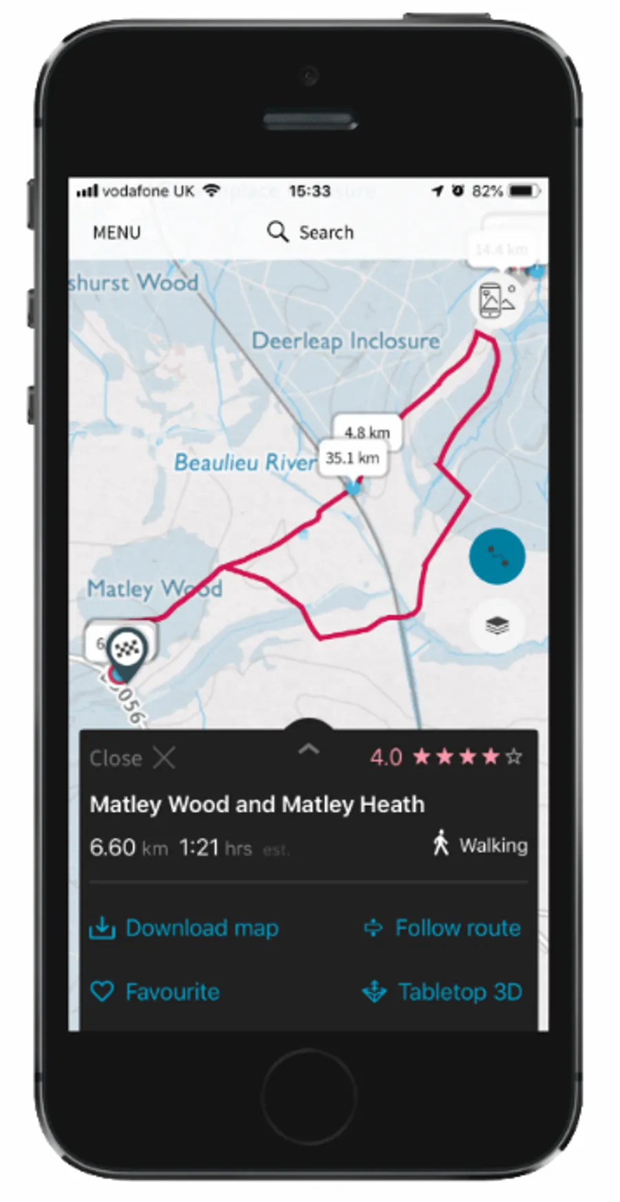
Since hearing about the ways in which these products are improving accessibility and mapping experiences for users, we have been exploring more ways we can expand the reach of this product, to help both the general public with walking and other outdoor activities, and those with a more technical background who use our maps in GIS software. We’ve been working with the OS Maps team to investigate whether later this year the CVD styles can be integrated into the online desktop service. This will make it even easier for colour blind walkers, runners, and cyclists to use our data to get outside.
"One of my GCSE geographers is colour blind and struggles to read maps in exams. It’s so great to see that you are trying to help people access these vital things. Going to show my pupil these and ask for his feedback."
All GCSE Geography exams in the UK currently include a map reading extract, which currently has no alternative supplement for students with CVD. Following feedback from teachers, we’ve been talking to exam boards and our cartography team to look at supplying extracts which are tailored to red-green and blue-yellow CVD as well as a monochrome alternative. We’re also in the process of testing colour schemes used for other OS products to see how accessible they are, and we will be looking into implementing more CVD friendly styles where these could be helpful.
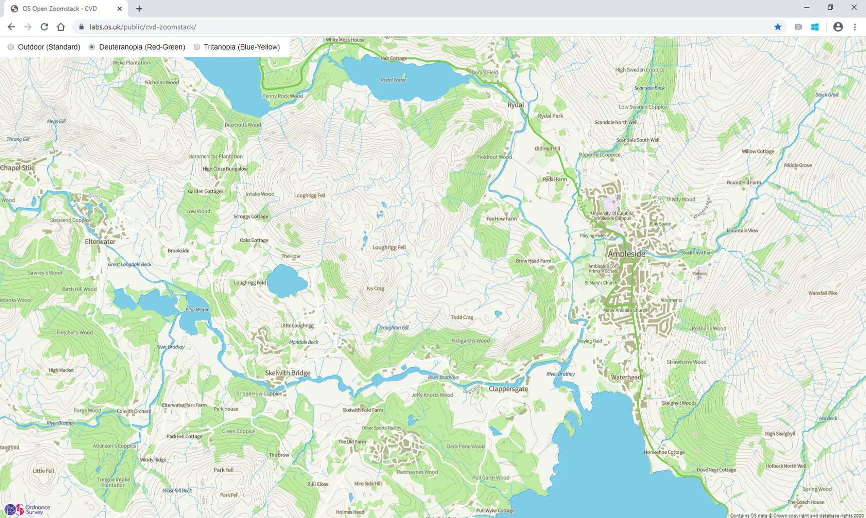
For those of us who don’t use GIS software, or just want to have a quick look at our data without having to download mapping tiles, we’ve developed an online map which allows you to explore the CVD styles of Great Britain at any zoom level. This can be accessed here: https://labs.os.uk/public/cvd-zoomstack/.
We’d still love to hear your thoughts on these two styles – whether you’re colour blind or not – to inform how we take this project forward and increase accessible mapping for as many people as possible. Let us know what you think at cartodesign@os.uk or on any of our social media channels.
Our highly accurate geospatial data and printed maps help individuals, governments and companies to understand the world, both in Britain and overseas.
Find more blog articles
- Products and services
- Developers