Thematic mapping techniques
In a world where we have access to an abundance of information, good data visualisation is more important now than ever before
When approaching data visualisation, we need to make sure the correct tools are being used. Most importantly, think about the best way to represent and convey the message that the data is trying to tell. Making a map when a chart or graph would suffice could lead to the data being interpreted incorrectly.
The art of map making (or cartography) is a form of data visualisation and there are a number of mapping techniques we can use to bring data to life.
Thematic mapping is how we map a particular theme to a geographic area. It tells us a story about a place and is commonly used to map subjects such as climate issues, population densities or health issues.
When creating a thematic map, it is important that we fully understand the data we are planning to depict and the consequence of representing this data incorrectly. Maps can sometimes misinform people, so choosing the correct map technique is crucial.
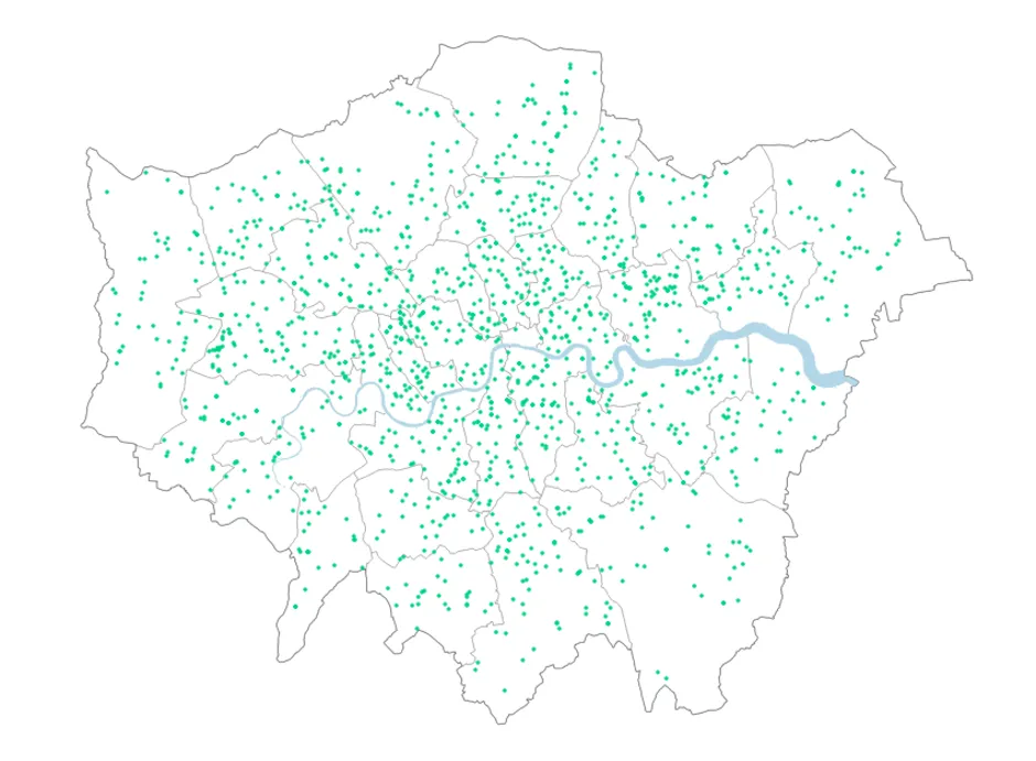
Dot Density Map
A dot density map is a map that uses a dot symbol to represent a feature. For one-to-one dot density maps, each dot is equally sized and each one represents the recording of a single thing. Each dot should be depicted in its correct spatial location to avoid the data being misrepresented and the message lost.
For one-to-many dot density maps, each dot depicts more than one recording of a thing and the amount each dot represents is determined by the cartographer. Dots can be randomly positioned and do not necessarily represent the spatial location of something. When creating a one-to-many dot density map, it’s important to include a legend indicating the value that one dot represents.
Advantages
- Shows density and distribution across a wide area
- Gives a good visual representation of variations across the data
Disadvantages
- Clustering can make the data difficult to interpret
- Areas with no dots can give a false sense of emptiness
- Geography can become hidden
- Dots on a one-to-many dot density map can be inferred as a single location of something
This method was used to great effect in the 19th Century when English physician John Snow mapped the location of cholera outbreaks. In doing so, he was able to connect the source of the outbreak to a nearby water pump.
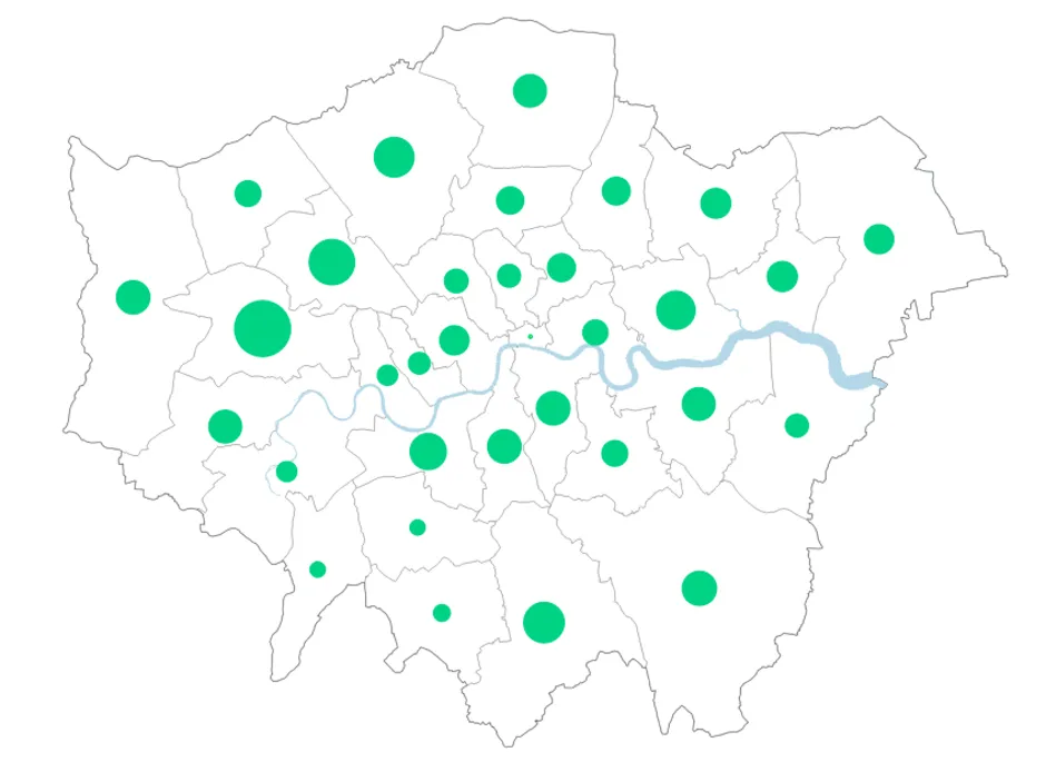
Proportional Symbol Map
A proportional symbol map uses map symbols that vary in size to represent a numeric variable. For example, circles may be used to show the location of cities within your map where each circle is sized proportional to the population of the city. This is one of the best methods for recording instances of something that falls within a geography.
Advantages
- Large quantities of data can be interpreted quickly
- Useful for visualising differences between many places
- Visually appealing
Disadvantages
- Size of symbols can obscure location.
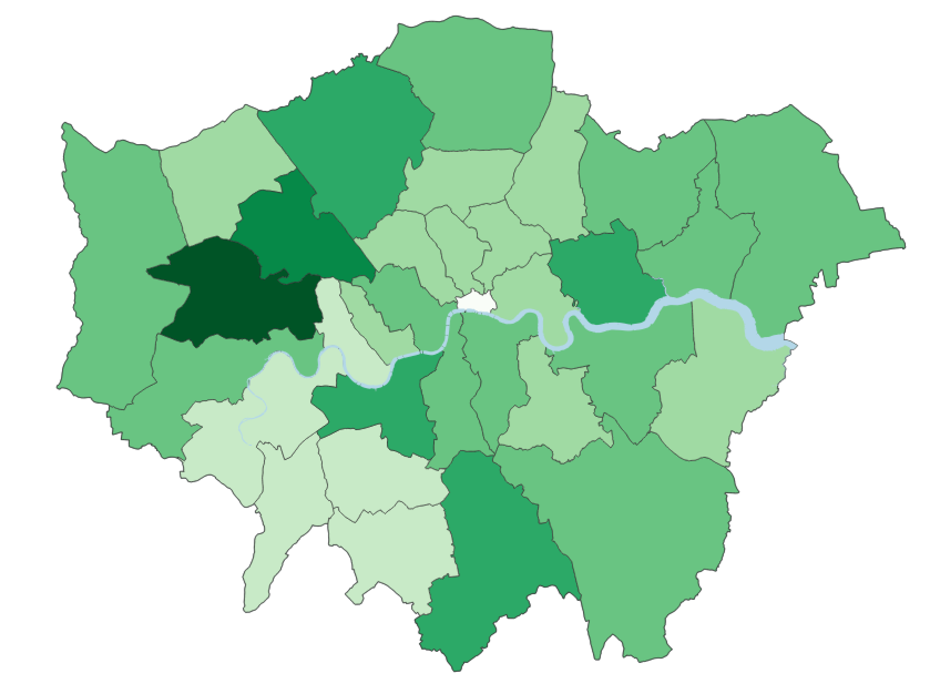
Choropleth Map
A choropleth map is a map where geographic areas are coloured or styled in relation to a value. This technique is useful when visualising how a measurement varies across a geographic area. This is commonly used when looking at vote totals by a political party.
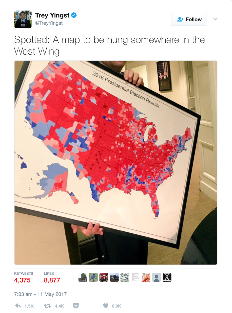
Shown to the right, Donald Trump famously shared a choropleth map with reporters in 2016 that depicted the results of the 2016 elections. The map was great at showing where people voted, but not for showing how many people voted. Perhaps a proportional symbol map would have been a better way to represent the data? Or what about a dot density map where each dot represents one vote and it quickly paints a different picture?
Advantages
- Depicts spatial distributions of data well
- Visually effective
Disadvantages
- Map assumes the whole geographic regions has the same value when in fact they may not
Heat Map
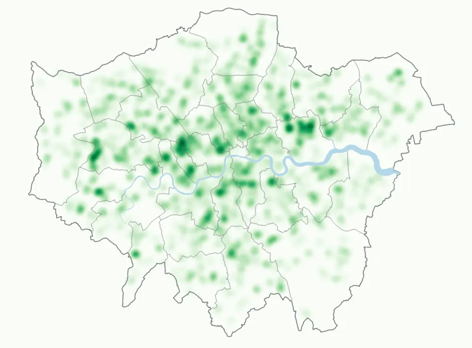
A heat map is a favourite amongst many and is used to represent the density of data in gradients of colour. Through the creation of a hot spot, it allows you to quickly identify areas for further analysis. They are typically used to depict things like crime hot spots or temperature.
Advantages
- Hot spots in data can be quickly identified and analysed further
Disadvantages
- Excessive use of colour can affect the legibility of the map
Equal Area Cartograms
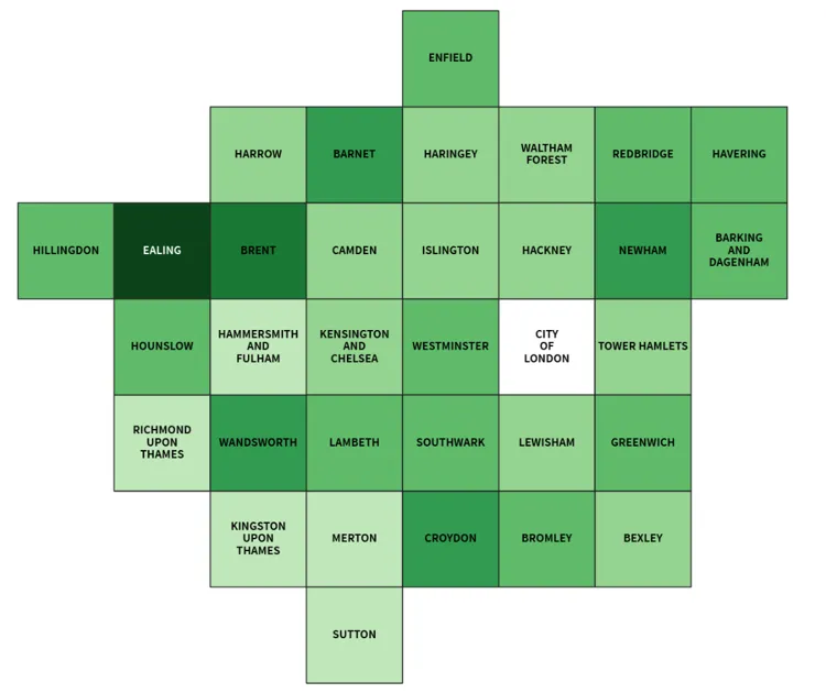
Cartograms use geographic shapes (e.g. countries) to size regions based on a data value. In an equal area, the one difference of a cartogram is that every shape has the same size, whilst keeping all of the other aspects associated with the cartogram – their spatial relationship should remain as close as possible. With this method, the use of colour is important and many people choose to add labelling stating the actual values.
Advantages
- Visually appealing
- Allows for the addition of depicting extra data
Disadvantages
- The location is not always 100% accurate
Summary
When considering your map technique, it’s important to think about other factors too. How will the map be used? Is it a web map or perhaps a static map? Are the connotations of the colour scheme suitable for the dataset type?
We have created some colour palettes which you can use to help with visualising your own datasets. These palettes are part of a wider toolkit that has a range of materials to help you. It includes symbols and cartographic design principles, a set of guidelines that you can follow to help with designing maps and data visualisations. It also includes a workshop on thematic mapping.
Mapping for Emergencies
From health emergencies to major incidents like flooding, Geographic Information (GI) is crucial. Data visualisations can often be used in these instances to make the information accessible to everyone.
We offer our Mapping for Emergencies (MfE) service to support the resilience community. Primarily aimed at emergency services, local authorities and NHS bodies, our MfE service provides geospatial support during any emergency or major incident whether it’s responding to natural disasters or security threats (all under the Civil Contingencies Act 2004).
Our highly accurate geospatial data and printed maps help individuals, governments and companies to understand the world, both in Britain and overseas.
Find more blog articles
- Reference
- Developers
- General public