Ordnance Survey's favourite maps of 2022
There have been so many maps and visuals, produced by some very talented people, and the standard just seems to be getting better and better every year. Inspired by all the brilliant work we’ve once again pulled together some of our favourites. So, make yourself a cup of tea, put your feet up and enjoy our favourite maps from last year.
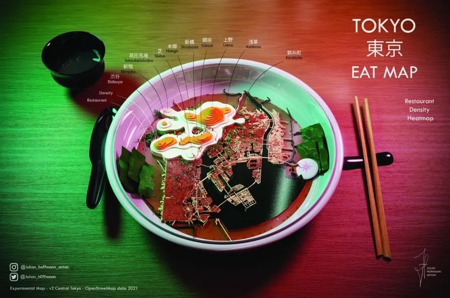
Tokyo Eat Map by Julian Hoffman Anton
The “Tokyo Eat Map” is a modern-day infusion of food meets map. This food “experiment” represents the density of restaurants in central Tokyo on a map, morphed into a typical Japanese ramen dish. It is a delicious mix of a heatmap, density map and contour visualisation, embellished with artistic liberties. Yum!
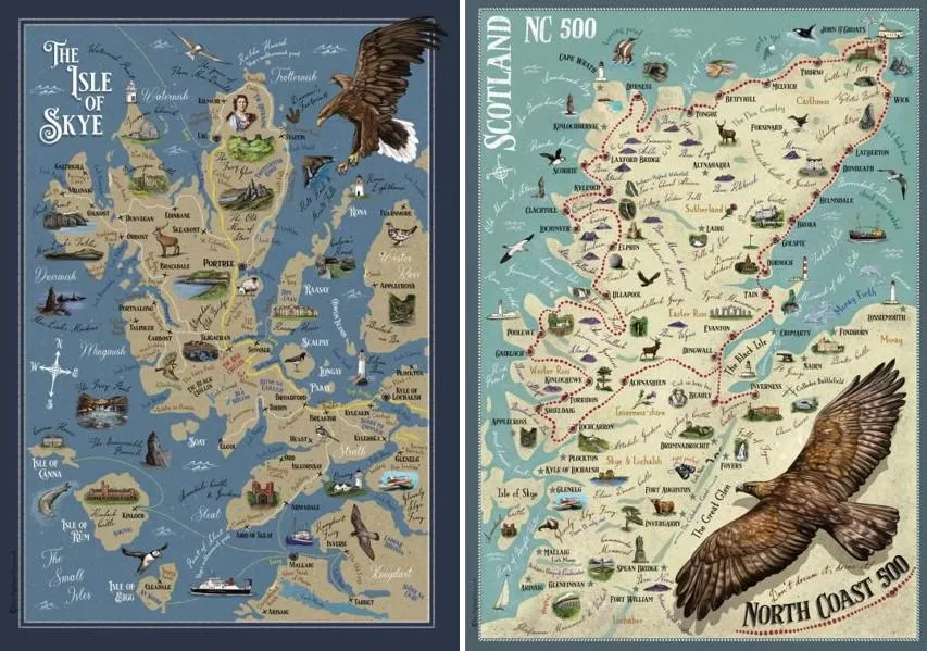
The Isle of Skye & North Coast 500 by Helen Liddle
These beautiful art prints by Helen Liddle depict the North Coast 500 route and the Isle of Skye. They are peppered with beautifully illustrated points of interest which draw you in and make hanging these on your wall a must!
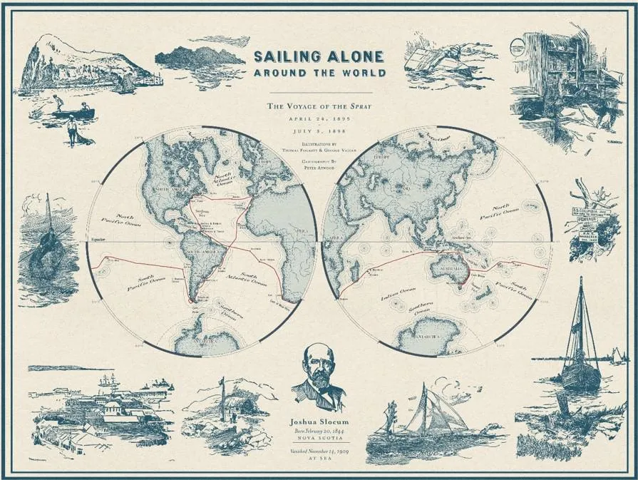
Sailing Alone Around the World by Peter Atwood
This sumptuous map by Peter Atwood charts the journey of Joshua Slocum. The first person to sail single-handedly around the world. The maps are clear, simple, and beautifully constructed with a range of illustrations by Thomas Fogarty and George Varia bordering the map. The map has an intended historic feel created by its perfect choice of colour.

New York City Tree Map by NYC Parks
This amazing interactive web map gives the user access to the trees of New York City. It includes the location, size of tree, any care activities the tree is receiving, and ecological benefits of the tree. It is easily the most comprehensive and up-to-date living tree map in the world!
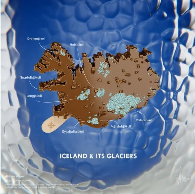
Iceland and its Glaciers by Julian Hoffman
It’s always nice to call out the annual #30DayMapChallenge whenever we compile our favourite maps of the last year because of the vast array of amazing submissions each year. We never aim to pick out a favourite as there are just too many to pick from, so we often look for something different or clever that caught our eye. This delicious and rather cool map of Iceland and its glaciers was submitted for day 26 of last year’s #30DayMapChallenge for the theme Island(s). It’s made using Blender and was made by the very talented Julian Hoffman.
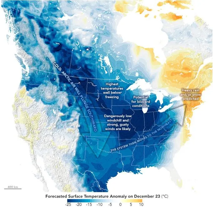
The Freezing Snowy Nightmare Before Christmas by Joshua Stevens
This map by Joshua Stevens shows the surface air temperatures that were forecast for parts of Canada and the central and eastern U.S. on December 23, 2022. The underlying map compliments the overlaid data which has been visualised using a simple diverging colour palette. The darkest blue areas indicate where surface temperatures are expected to drop at least 25 degrees below the average. There are also some great annotations highlighting some of the weather conditions expected and a subtle use of arrows to show the direction of the cold system. An amazing map that highlights the reality of those temperature anomalies.

Map your London by the Great British Public
And last but by no means least is this beautifully hand drawn, crowd sourced map of London. This map formed part of a recent Royal Institute of Navigation Exhibition at the Royal Geographic Society where we invited visitors to map their own view of London. The exhibition coincided with the Queens lying in State at Westminster so became a historic snapshot of London at that time.
The Withering Mississippi By Laris Karklis
This poignant but beautiful map by Laris Karklis was made for the front page of the Washington Post back in late October, 2022. The map highlights the dreadful impact months of dry conditions has had on the Mississippi river and picks out key areas along its route where water levels were lowest. The map supports a stark story that reminds us of the impact such conditions have on those people whose livelihoods depend on the river. To enjoy the map fully check out the full story.
Sharing the latest news about OS. We can license you to use OS maps in print, online and film format. For more information and resources for journalists, bloggers and media professionals, email pressoffice@os.uk or call 023 8005 5565.
Find more blog articles
- Leisure
- Communities
- OS
- General public
- Great Britain