Our favourite maps around the world in 2021
Once again we have been treated to some truly inspiring and excellent examples of cartography and visualisation. The standard of map making seems to get better and better every year so make yourself a cup of tea, put your feet up and enjoy some of our favourite maps from last year.
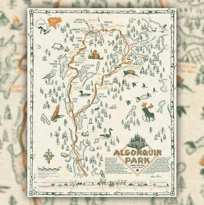
Algonquin Canoe Trip – Warren Davison
Made by Warren Davison this sumptuous map of Algonquin Park is both beautifully illustrated and expertly designed. The map boasts numerous features for which to draw you in including a wonderful north arrow, two-colour palette, brilliant border and excellent elevation profile.
We absolutely adore this map.
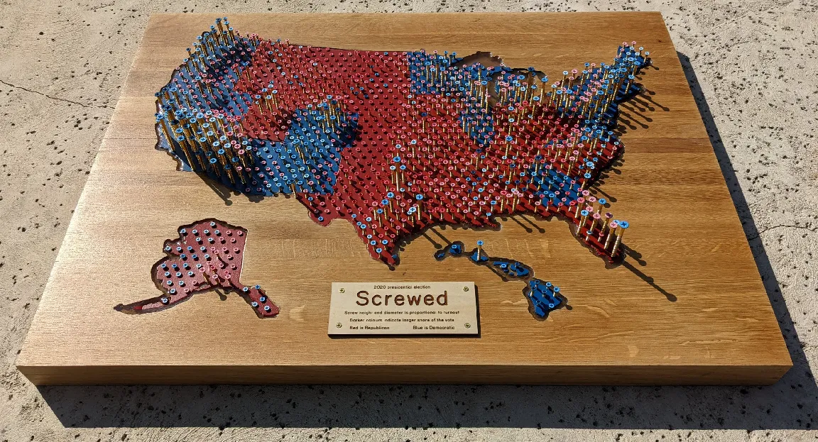
Screwed – Ken Field
Screwed is the brainchild of renowned cartographer Ken Field and is a lockdown project made from an old countertop and over 1,000 screws! It is a glorious 3D map depicting the 2020 Presidential Election results. Screw height and diameter were proportional to population density and turn out whilst the lighter and darker red and blue shades on the screw heads represented votes for the Republicans or Democrats. We love the imagination and technique behind the map and Ken spent many hours building and perfecting something that is truly unique.
How large is the Brunt Shelf breakaway iceberg? – Steven Bernard
We are massive fans of the visual journalism team at the Financial Times and each year their maps and data visualisations seem to get better and better. This great digital piece from Steven Bernard explores the story of the Brunt Shelf iceberg breaking away in February last year and shows how it compares in scale to familiar geographic regions. The maps are simple and not cluttered and adopt a perfect colour palette to emphasise where necessary. The Full FT article can be found here but is behind a paywall.
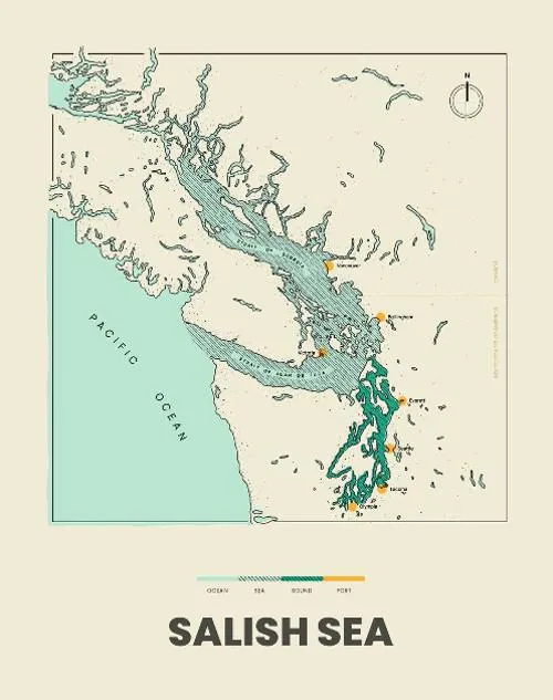
Salish Sea - Catalina Plé
Catalina Plé is a designer who makes charts, maps and infographics. This stunning hand-drawn map of the Salish Sea is simple but you can tell that every element from the colours, fonts and fill patterns has been so well considered.
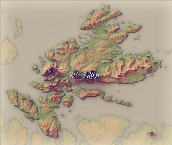
Isle of Skye & Raasay, Scotland – Owen Powell
A beautiful map created by Owen Powell, using OS Open Zoomstack to create his own custom basemap. Everything feels so well considered with this map, from the hillshade colours, shadows, and 3D labelling. It even has little 3D hill summit markers – the attention to detail is amazing.
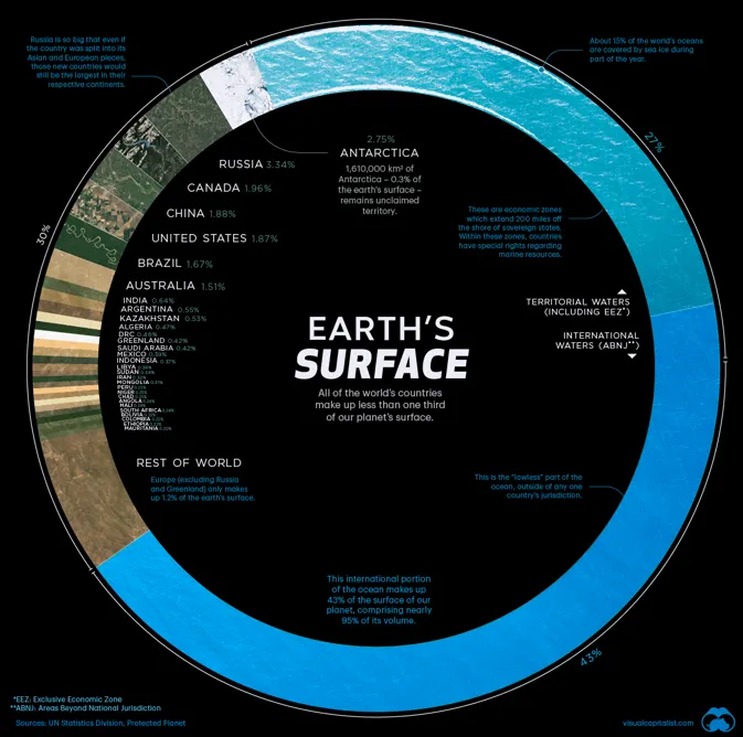
Visualising Countries by Share of Earth’s Surface – Nicholas LePan
This is a really impactful visualisation that illustrates the Earth’s surface by countries and oceans. We really like the way it uses geographic data to simply illustrate the percentage of the Earth’s surface that is made up by land and water. The graphic is easy to interpret and is a great tool to help educate and inform.
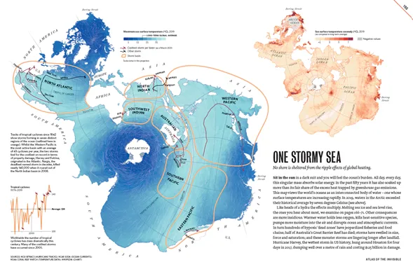
Atlas of the Invisible – James Cheshire and Oliver Uberti
James Cheshire and Oliver Uberti have combined again to create another excellent award-winning book. The Atlas of the Invisible transform’s important datasets into beautiful maps and modern visualisations using techniques that are both new and imaginative. The book is a cartographic masterpiece that invites us to revel in the invisible patterns that have and continue to shape our lives.
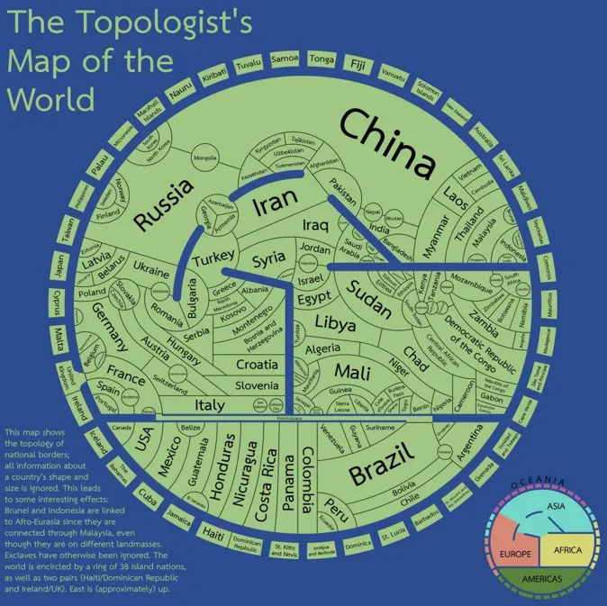
Topologist’s Map of the World
I’m sure it could be debated whether this is technically a map, a chart, an infographic etc… but it has ‘map’ in the title so we’ll go with that! It was created by astronomy PhD student Tom – who started with a Voronoi diagram and finished this project in Inkscape. It’s one of those visualisations which you could look at for ages – comparing it to a traditional world map to help you see it from a different perspective which is why we love it so much.
You can read more about Tom’s process of creating this map here, and even buy a copy of it here.
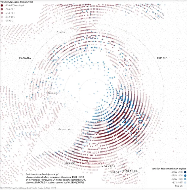
Arctic frost days and ice concentration in 2100 - Gaëlle Sutton
This map was Gaëlle Sutton‘s entry to the #30DayMapChallenge for the ‘Points’ prompt. It is a depiction of the number of frost days and ice concentration in the Arctic in 2100, if we see 2 degrees of global warming. Areas of darker red and blue are where the model shows there will be a much lower number of frost days and concentration of ice in 2100, compared to the current number. The circles radiating from the North Pole and simple country labels keep this complex subject matter from feeling cluttered and it does a fantastic job of inviting the viewer in.
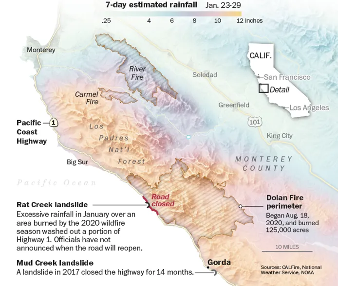
Highway One – A road like no other – Laris Karklis
This map by Laris Karklis was created as part of a longer piece for the Washington Post, looking at the threat of Californian wildfires to Pacific Coast Highway. It’s a brilliant example of a good visual hierarchy – with transparency, colour and labels being used together to show a few different datasets at the same time and in a way which is really easy to understand. The colours used give it that beautiful hazy effect which made it one of our favourites of the year. We’d highly recommend having a look through the Storymap for more context and detail on this too.
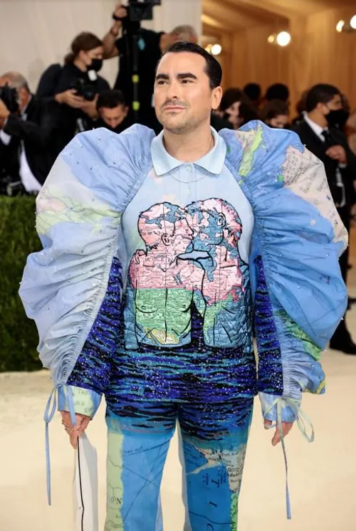
Dan Levy at the Met Gala
Not a map so much, but a map themed item which caught our eye was Dan Levy’s outfit at the 2021 Met Gala. His map adorned outfit was to highlight the resilience and joy of the LGBTQ+ community, despite world borders and nations where homosexuality is illegal. Such a great message and perhaps maps can be used to improve any outfit!
Our highly accurate geospatial data and printed maps help individuals, governments and companies to understand the world, both in Britain and overseas.